
Why Some Amsterdam Apartment Buildings Look Premium While Others Dont

Some Amsterdam apartment buildings look expensive before anyone checks the floor plans, the finishes, or the sales history. They simply carry themselves better. The brick looks clean. The windows line up. The entrance feels calm. The bicycles have a place. Even the lighting seems considered.
Then there are buildings with the same location, similar age, and sometimes the same architectural bones that feel less desirable from the sidewalk. The issue is rarely one big flaw. More often, it is a pileup of small details: tired paint, cluttered thresholds, uneven repairs, messy signage, and public spaces that nobody seems to own.
That is the quiet difference between a building that looks premium and one that only looks occupied.

Premium buildings look managed before they look expensive
A premium-looking apartment building gives a clear first impression: someone is paying attention.
That does not always mean luxury materials or a grand lobby. In Amsterdam, many of the most desirable buildings are modest from the outside. Their appeal comes from order, proportion, upkeep, and restraint.
A building starts to feel premium when the shared parts look cared for:
The front door closes properly and looks solid.
Mailboxes are neat and consistent.
Intercoms are clean and not patched together.
Hallway lighting is warm and even.
Windows, frames, and railings look maintained.
Waste storage does not dominate the entrance.
Bicycles are organized instead of piled against the facade.
None of these details is dramatic. Together, they create trust.
People read buildings quickly. A chipped doorway, a loose handle, or a dirty stairwell can suggest deeper neglect, even if the apartments themselves are beautiful. By contrast, a simple building with clean lines and steady maintenance can feel far more premium than a showy one with poor care.
In Amsterdam, this matters even more because many apartment buildings have shared ownership structures. The condition of the entrance, staircase, roof, facade, and common systems often reflects how well the owners association, or VvE, functions. A well-run VvE may not be visible on a sign, but it shows in the building’s face.
The facade tells the story first
Amsterdam’s architecture puts facades on display. Narrow streets, canals, bridges, and close building lines mean people experience apartment buildings from a short distance. There is little room to hide poor maintenance.
A premium facade usually has three qualities: consistency, cleanliness, and proportion.
Consistency means the windows, frames, balconies, railings, and exterior colors feel like they belong together. The building may have been updated over time, but it does not look randomly altered by each owner’s personal taste.
Cleanliness is not about making an old facade look new. Amsterdam buildings often look best when their age remains visible. Cleanliness means the brickwork is not stained by runoff, the stone details are not crumbling, and the window frames are not peeling.
Proportion is harder to define, but easy to feel. Premium buildings respect the rhythm of the street. Window sizes, balcony additions, awnings, and exterior fixtures fit the architecture instead of fighting it.
Small changes can damage that rhythm. One apartment installs bright white plastic frames. Another adds heavy curtains visible from the street. A ground-floor unit places random signs in the window. Over time, the whole building starts to look less coherent.
That is why some older Amsterdam buildings still look refined while newer or recently renovated ones do not. The best buildings protect the original character while making practical updates carefully.

Entrances carry more weight than people think
The entrance is where a building makes its most concentrated impression. It is the handshake.
A strong entrance does not need marble or a doorman. It needs clarity. The door should be easy to identify. The threshold should be clean. Lighting should make the space feel safe without turning it harsh. Names, numbers, mailboxes, and intercoms should look intentional.
Premium entrances often share a few traits:
A door that feels substantial and well fitted
Hardware that matches the age and style of the building
A clean mat or stone threshold
Hidden or tidy utility access
Good lighting at face level
No random notices taped to glass
No overflowing bins beside the door
By contrast, a poor entrance can make a good building feel tired. Too many stickers, mismatched buzzers, broken tiles, old paper signs, and visible cables send a message that nobody is controlling the details.
This is one reason two similar buildings on the same street can feel so different. The premium-looking one has a front area that has been edited. The other has allowed every practical need to stay visible.
Amsterdam buildings face real constraints. Space is tight. Bicycles need somewhere to go. Waste collection has to be handled. Historic details may limit what can be changed. Still, the best buildings solve these issues with care rather than letting them spill into the first impression.
Shared spaces can add or remove value fast
Once inside, common areas either confirm the premium impression or undo it.
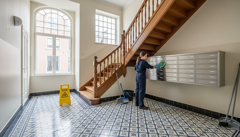
Many Amsterdam apartment buildings have narrow staircases, compact halls, and older layouts. Those features can feel charming if the space is clean, lit well, and maintained. They can feel cramped and neglected if the walls are scuffed, the lighting is cold, and storage has crept into every corner.
The quality of shared spaces comes down to routines. Premium-looking buildings usually have routines for cleaning, repair, repainting, and decluttering. Less polished buildings often handle issues only when they become impossible to ignore.
The difference is visible in places like:
Detail | Premium impression | Tired impression |
Stairwell walls | Fresh, simple, scuff-free | Marked, chipped, unevenly painted |
Lighting | Warm, even, reliable | Flickering, harsh, or too dim |
Floors | Clean and repaired | Worn, stained, or patched |
Storage | Planned and discreet | Random items in shared areas |
Notices | Minimal and current | Old papers taped everywhere |
A premium building does not have to feel staged. It should feel easy to live in. That means the shared spaces support daily life without looking chaotic.
This matters for residents and visitors alike. A buyer or renter may only spend a few minutes in the common areas, but those minutes have a strong effect. If the hallway feels neglected, people start wondering what else has been postponed.

Materials matter most when they age well
Premium buildings usually have materials that age predictably. That does not mean everything is expensive. It means the materials can handle weather, touch, cleaning, and repair.
Amsterdam’s damp climate is not kind to cheap exterior choices. Paint peels. metal stains. Poor sealants fail. Low-quality fixtures look tired fast. When materials age badly, a building can look neglected even when it is structurally fine.
The best-looking apartment buildings often use straightforward materials with a long life:
Brick that can be cleaned and repointed
Painted wood or high-quality frames suited to the building style
Stone or durable tile at thresholds
Metalwork that can be maintained
Simple lighting fixtures that do not date quickly
Neutral colors that fit the street
Cheap replacements can create an immediate downgrade. Bright plastic window frames on a historic facade, overly glossy doors, flimsy railings, and mismatched exterior lights often make a building feel less premium, even if they were installed recently.
There is also a difference between renovation and renewal. Renovation can sometimes erase character. Renewal keeps the best parts of the building and improves what no longer works.
In Amsterdam, that balance is crucial. The city’s most appealing apartment buildings often preserve their architectural rhythm while quietly improving comfort, safety, and durability.
The most polished buildings control visual noise
Premium buildings tend to be visually calm. Less premium buildings often feel noisy.
Visual noise comes from too many small, unrelated elements competing for attention. It might include security stickers, old doorbells, mismatched curtains, exposed wires, plastic planters, random signs, multiple bike locks attached to railings, or bins left in view.
One or two of these details may not matter. Many together change the building’s mood.
A calm building usually has rules, formal or informal, about what belongs where. Residents may agree on window coverings facing the street, balcony use, bike storage, holiday decorations, or notice placement. The goal is not to make the building sterile. The goal is to keep shared visual areas from becoming a collection of private decisions.
Balconies are a clear example. A balcony with plants, a small table, and clean railings can add life. A balcony packed with storage boxes, laundry racks, broken chairs, and plastic sheeting can make the whole facade look disordered.
The same is true at street level. Amsterdam streets already carry a lot of activity. Bikes, pedestrians, delivery traffic, bins, canals, trees, and signs all compete for space. A building that adds more clutter to that scene loses its premium feel quickly.
Good lighting changes everything after dark
A building can look elegant by day and flat at night if the lighting is wrong.
Premium lighting is usually subtle. It helps people find the entrance, makes the doorway feel safe, and highlights architectural details without turning the facade into a stage. Warm, well-placed light often works better than bright white fixtures.
Poor lighting creates opposite problems. Too little light makes an entrance feel neglected. Too much light can make it feel harsh or cheap. Mismatched bulbs and fixtures suggest repairs were made one at a time without a plan.
Good apartment building lighting often includes:
A clear light at the entrance
Soft illumination in the lobby or hall
Consistent bulbs in shared spaces
Fixtures that suit the building’s age
No exposed cables or awkward add-ons
Lighting also affects how clean a space feels. Scuffs, dust, and stains become more obvious under bad light. Under warm and even lighting, simple materials can look much better.
This is one of the most cost-effective ways a building can improve its appearance. It does not require changing the architecture. It requires choosing the right fixtures, placing them well, and maintaining them.

Why some buildings fall behind
A building rarely starts out looking neglected. It drifts there.
One repair gets delayed. A temporary sign stays up for months. A broken fixture is replaced with whatever is easiest to buy. A resident stores items in the stairwell. Paint fades. The entry mat wears out. Nobody takes responsibility because each issue feels too small on its own.
The result is a building that looks lower quality than it really is.
Common reasons include:
Weak coordination among owners
Unclear maintenance budgets
Repairs done only in emergencies
Short-term fixes instead of planned updates
No shared standard for visible areas
Poor cleaning routines
Too many small changes made without design control
A strong VvE can prevent this drift. So can a clear maintenance plan, even for a small building. The key is to treat appearance as part of asset care, not decoration.
Premium appearance is not vanity. It affects how residents feel, how visitors judge the property, and how future buyers read the building. A cared-for exterior signals that the less visible parts may also be cared for.
The real difference is discipline
The buildings that always look premium are not always the newest, richest, or grandest. Many succeed because they practice discipline.
They repair before damage spreads. They choose materials that fit. They keep shared areas clean. They limit clutter. They respect the facade. They make practical things, like bikes and bins, feel planned rather than accidental.
That discipline compounds over time. Each small choice supports the next one.
The buildings that do not look premium often fail in the same quiet way. They allow small compromises to stack up until the whole place feels less cared for. Nothing has to be terrible. It just has to be inconsistent.
Amsterdam rewards buildings that age with grace. A premium look comes from care, restraint, and shared standards. When those pieces are in place, even a simple apartment building can feel desirable from the street. When they are missing, even a good address can lose its shine.


Comments